Design Language - an essential part of market and business strategy
Solene Bourgeois
Design Language = DNA of your product offering
Design language goes hand-in-hand with brand identity. Just as brand identity strongly influences a company’s name, tagline and graphic application of its logo, design language defines physical characteristics, color, material applications and three-dimensional logo treatments of a company’s products – whether they be a physical product or digital a product, such as mobile or web apps. The guidelines apply even to packaging, exhibition booths and user interface and customer experience.

Why is it important?
On a business strategy level, common design language creates coherence among company products, building greater brand awareness when consumers identify and recognize the different products as part of the same family.
For example, Apple has a wide offering of products from phones, tablets, laptops, and now a watch. Even though each product has a different form factor, each has the same aluminum finish and contrasting black or white plastic. The simplicity and quality of the material and finishes is a subtle physical way to create a consistent design language, and enhance brand recognition and uniqueness in the market.
For the internal functioning of a company, having a strong design language minimizes product reinvention between often siloed departments. Ultimately, it can help shorten the time needed to launch a product. A common design language will take into consideration complex requirements on multiple fronts: for users, for materials, for the market, for the regulatory environment.
MARKET AND BUSINESS STRATEGY
The first step in creating a design language involves strategy, and depends on the company’s stage of development. If it is a new venture with a first product, or an established company entering a new product category, the design team will gain an understanding of overall market and propose a strategic positioning, including brand values. If instead, the company already has a foothold in a market, the design team would look at potential new markets, offering its expertise as design visionaries.

BRAND VALUES
Below are examples of typical brand values that could be applied equally well to a consumer medical or a biotech diagnostic product.
Consumer feel
Medical products – even those found in labs – are expected to meet “consumer” design standards found throughout products used in today’s modern digital lifestyle. These include highly intuitive interfaces, quality finishes, a broader color palette, higher speeds and responsiveness.
Related words: approachable, modern, fresh
Iconic
An iconic brand value captures the essence of the product in a strong, simple, innovative statement. Its ultimate goal: become the leader of a product category.
Related words: exemplary, disruptive, innovative
Intuitive
With a consumer medical product – either physical or digital in nature – ease of use is paramount. It can create the desire to use this new product. And in the case of chronic disease, for example, intuitive design can also increase the chances for behavior change.
Related words: integrated, ease of use, simple
High quality
The premium look and feel of a product translates into the selection of quality finishes and materials, as well as a tight fit between product parts. The sound and how a product feels to a user’s touch also impacts quality perception.
Related words: premium, high value
PRODUCT VISION
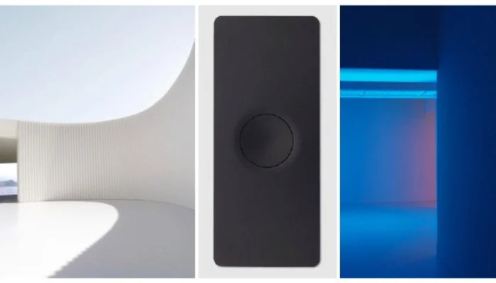
Designers curate images – referred to as mood boards – that communicate the “look and feel” of the brand. This is an iterative process, including brainstorming and feedback with the client. The boards can include other products in the market, or even abstract shapes, textures or pictures.
EMOTIONAL ATTRIBUTES: FUN - PRECISE - WITTY
VISUAL VOCABULARY: FLUID SHAPES - CONTRASTING COLORS

GUIDELINE DOCUMENT
Designers write a design document that specifies the brand values and the primary guidelines that address the overall spirit of the product. The document also includes the secondary guidelines that capture its details of the product’s design. The guidelines also extend in some cases to the application for the packaging and user interface.
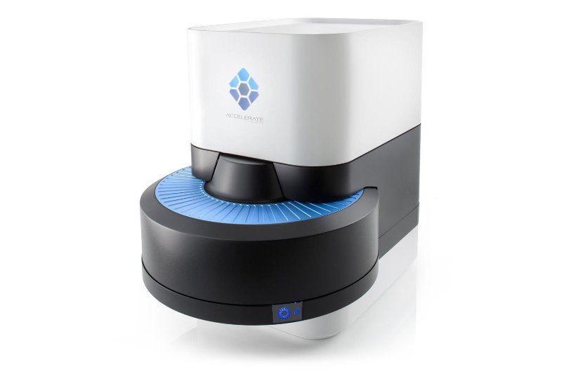
Below is an example of a Design Language Guideline Document for Accelerate Diagnostics, Inc.
Consumer feel - approachable, modern, fresh
Unlike many clunky and large lab diagnostic products, Accelerate’s product is minimal and compact, creating a new standard for lab diagnostic products. The look is modern with a flat white/black non- textured paint. The product was created using injection molding instead of the typical pressure forming. All assembly elements have been removed from the user view, making the product much more approachable.
Iconic - exemplary, disruptive, innovative
The design celebrates clean, crisp lines and colors, and draws attention to the product’s differentiating carousel technology. The circular shape is also becoming the key element of the user interface design to show the progress of the analysis.
High Quality - premium, high value
A substantial aluminum base-plate is the foundation of the internal chassis and also highlighted as an external visual feature. The automatic opening and smooth movement of the product’s door adds to its high performance. High quality manufacturing resulted in parts that fit tightly together.
Trustworthy - reliable, accurate
The design communicates stability and robustness, both important for a product used to diagnose potentially life-threatening conditions. The user interface of the control display is simple and easy to understand, it tightens the product and interface together for a more coherent experience.
Form/Function - efficient, obvious
Accelerate’s innovative technology utilizes a carousel system rather than the standard grid. The design draws attention to the circular carousel, reflecting the rotation mechanism inside the product, and communicating process speed via the oblong pattern on the top of the door.
Intuitive - integrated, ease of use, simple
A careful workflow analysis led to a design that cut the number of operation steps by more than half, saving critical time for potentially life-saving diagnoses. The design simplifies the user interface by having only one button to operate the automatic door.
PRIMARY GUIDELINES

Straight lines - Straight 90° angles and straight lines, minimal draft or curved lines. Perfect rectangles, squares or circles, no ovals
Distinctive elements - When two elements intersect they keep their own identity without trying to blend into each other.
Generous radius - Corners should be perfect radius, no curves.
Concentric shapes - All elements should be as symmetric and concentric as possible
Tight radius - On the edges the radius are kept minimal, between 0.2 and 1.5 mm
SECONDARY GUIDELINES

Large chamfers - When certain features need to feel smaller large chamfers can be used
Small chamfers - Details are formed with a tight chamfer
Oblong pattern - Details are treated with oblong shapes for rotation pattern or ventilation patterns